Let Them Make Fonts
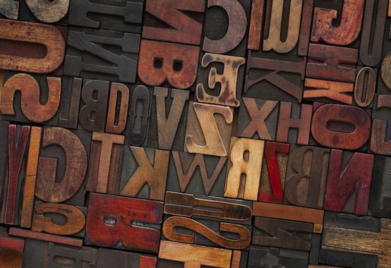
There must be millions of fonts in the world by now—carefully crafted since the beginning of alphabets, each featuring a swath of slants and shades, kernings and serifs. Yet people are always making more fonts. Is it time to stop? In a piece at The Atlantic called “Why Invent New Fonts?“, author Steven Heller discusses this question with a typeface designer:
House releases one new or revamped alphabet every two months, and “most of the type we draw is initially for our own use,” says Rich Roat, a co-founder of the Yorklyn, Delaware-based digital foundry. Carnival is made for headlines or display copy, and its thick and thin lines are certainly attention-grabbers.
… But given the huge number of typefaces already available, it’s worth wondering why more of them are necessary. Roat’s answer is common but logical: “Why do we need new music, new cars, new clothes?” In fact, type has become part of today’s digital and cultural consumerism. A fashion analogy works here. “Let’s be honest: You buy the Prada suit because the model looks so good in it,” Roat says. “We try to make beautiful things with our fonts for the same reason.”
Roat is right to see consumerism and stylistic preference in font creation and usage today. We like typography to fit our selves, or our businesses—and interestingly, it does offer us a broad palate with which to color our letters. When it comes to company or personal branding, typography can make a world of difference. The variations between New York Times and Garamond may be slight, but the differences between Times and Futura are quite striking. People who see the Facebook logo font can easily tell it apart from Google or Yahoo.Typography helps our eye differentiate between the brands.
Fonts are a form of both visual and literary communication: they capture our attention, and help us to feast on words’ beautiful presentation. They can increase our focus, influence our reading “mood,” or remind us of things like tax forms and picture books. There is often an aura either of dignity or whimsy that accompanies a font, and thus a variety of appropriate situations corresponding to each. Fonts are integral to storytelling and communication—they build our language, communicate our ideas. They draw or repel the eye, depending on their shape, size, and other attributes. Font choices can make or break a story. If we use an inappropriate font, to the story or situation, we run the risk of, at best, losing our readers’ attention, and at worst, opening ourselves up to mockery. This should be evident from the abuse that has been heaped on Comic Sans over the years—it’s quite easy for people to hate a font, or for a font to go out of style.
Nonetheless, each font is an artistic statement. It takes words, and turns them into art. It makes language beautiful to the eye as well as the ear. And despite the millions of fonts in existence, still others—each with their own variety of vintage and modern influences—enter the typographic world every day.
Perhaps eventually we will run out of new font ideas. There are a finite amount of possibilities in the ways we can craft a letter, after all—just as there are a finite number of notes on a piano, or a finite number of colors on a color wheel. But we haven’t stopped writing stories, composing songs, or painting pictures. So I think there’s room for a few more fonts yet.